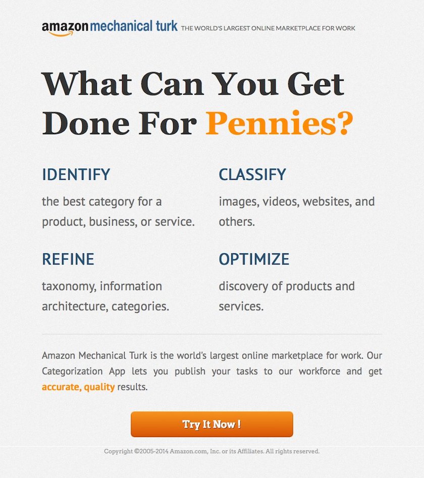
Lead a design team across 3 strategic pillars for Google Ads internal Sales CRM.
Lead UX @ Pure. Collaborate with team to create simple and insightful visualization to tell stories about customers' data.
Coached, mentored, role-modeled, and help grew students into industry-ready designers. Challenged status quote from Day 1 to raise the bar for our curriculum, delivering education that ultimately got our students UX design jobs.
A UX team of One at Amazon's crowdsourcing marketplace. I evolved our marketplace through research, design and customer experience-driven initiatives to achieve our business objectives.
UX owner of IBM Rational's two flagship enterprise development and collaboration software platforms. I also led team of 2 designers and managed our Design Partner Program.
Usability owner and UI designer of a web application for software developer collaboration. Responsible for research, design, and testing of 20+ widgets running on the Websphere Portal.
Responsible for a variety of UX tasks that included usability testing for website, user interface design for desktop developer software, and the design and improvement of the installation experience.
Graduate student at the Ergonomics in Teleoperation and Control Laboratory, specializing in 3D perception and augmented realities.
Undergraduate degree in the Mechanical and Industrial Engineering program.
Leading design at Pure and beyond (2016 - 2021)
Design is a team sports at Pure. As the Head Designer on GUI UX, I have the privilege to collaborate with some of the smartest professionals - designers, PMs, data scientists and engineers on shipping features such as our Pure1 dashboard (1Q2018), the first release of our Tagging feature (2Q2018), v2 of our Pure1 mobile app (3Q2018), and our very first upstack (beyond storage) analytic visualization: VM Topology (4Q2018):
Behind every one of these beautiful finishes and deliverables were months and months of research, wireframing, design critiques, feedback gathering, and countless iterations. Excruciatingly painful at times, but those moments were what designers live for.
Tagging One of the most time-consuming design tasks in the Tagging project was to nail down the keyboard interactions in using tags as filter on our global filter bar. One of my key design goals was to make this feature keyboard-friendly. We achieved this in the end, but in between the start and finish line, I went through numerous cycles of prototype testing and behavioral tuning to get the UX right.
Mobile app 2.0 For our mobile app 2.0, our team’s UI designer was the driver in the redesign, doing a wonderful job in extending the use of cards from our desktop experience into our mobile app. This approach not only made perfect sense on the UI, but was a huge benefit for our users in realizing a consistent UX with seamless continuity between desktop and mobile. As the UX lead overseeing the project, my main contribution was to segment the information into primary, secondary, and tetriary; and made informed choices on what content to leave out in the mobile experience. Oh yeah, I also fought to get those inefficient drop downs out of our mobile app. It worked out quite well.
VM Topology The VM Topology project was by far one of our most challenging projects up to that point of our design journey. Our VP of product took inspiration from site analytics tools and proposed flow visualization as the core UX design element we built around. We validated this concept with customers at our Accelerate conference. In the following months, we worked with VMware expert to gain use cases insight, with our backend engineers on phone-home data availability, with our front-end engineers on iterative prototyping, and with our PM in sourcing customer feedbacks. Over the course of the next 6-7 months, our design team fleshed out the UX and UI of the flow diagram, the filtering mechanism to ensure scaling, the selection mechanism for graphing, and came up with a new design pattern for displaying metadata for the flow nodes and graphs. It was extremely challenging, but the outcome was magnificent. When the feature was launched, it quickly became one of our brand’s differentiators because of benefit like this,
Pure1 VM Analytics tool allows me to look at a VM and see the storage path and know exactly what’s happening - the coolest thing I have ever seen.
My role has been steadily expanding during a time when Pure's portfolio is rapidly growing. While IC work remains a staple of my design-diet, my focus these days is as much about running a high performing design team as it is to craft the UX design for our next big feature.
As head designer, my goals wrap around:
Leading design goes beyond leading a design team. It is as much about building and fostering a trusted working ecosystem with our peers in engineering, product management, and managers. This means:
Hanging out with some of our GUI devs at Five Guys. In case you wonder... no, it was a pure (no pun intended) coincidence we had 5 guys...
Two of the biggest reasons for me to join Pure in the first place - two of my ex-IBM colleagues at Pure, and now we're all Puritians.
At this stage of my UX career I remain excited about growing as a UX professional, and working at improving my craft everyday just like it was Day 1. Since I started teaching UX in 2016, I have also developed a love for teaching and coaching UX designers to help them grow.
Outside of Pure, I run a monthly UX bootcamp, and provide an on-demand 1-1 UX career consultation service (see Eventbrite). Through these opportunites I have the chance to meet passionate UXers (or UXers-to-be), and share my know-how's with them to help them succeed. As a complement to my teaching, I also blog on Medium to share insights with other designers, focusing on the demographic who aspires to get into UX but unsure of how.
I've run my bootcamp in 3 countries (US, Japan, Hong Kong), and am looking to take this to more countries down the road. It's fun teaching UX, but just as fun meeting people who are curious about design.
Streamlining the shopping and checkout experience (2Q2014)
Amazon has kiosks at major US airports and selected shopping centers for customers to buy Kindle devices and accessories. Early version of the kiosk UI was essentially a minimal viable product that had weak branding, poorly designed screens, and an overall clunky purchase-to-checkout flow. Through referral from one of my mentors, I came across this project and volunteered my time to work with another designer to improve the UX.
Our improved design...
User navigation was also made more intuitive. This was a critical goal for our redesign as our persona had short attention span and was usually in a hurry at locations like airports and shopping malls.
In the first few weeks following the release of the redesign, we saw an uptick in the conversion rate and a decrease in the checkout abandonment rate. With the redesign, we also anticipated an improvement in average session time for those who make purchases (i.e. shorter time to checkout) but I don't have the data to confirm this improvement due to data security and privacy policy for non-immediate team members.
Below is a set of illustrations contrasting the differences between the "Before" and "After" of the design change.
The previous home screen adopted the standard vendor template. It was weak in branding and also lacked excitement.
The redesigned home screen leveraged the Kindle branding & offered a more polished aesthetic and inviting metaphor.
The previous version of the product detail screen - Product info was very difficult to scan. The lack of warranty information and return policy weakened purchase confidence.
The redesigned product detail screen improved ease of content scanning, took advantage of amazon customer reviews, and brought the warranty information into the fold.
The previous version of the shopping cart screen employed a traditional design. The cart metaphor was also inappropriate.
The redesigned shopping basket was always visible, making it easy to view the items in it (and the price total).
This was a short 2-month project. In this project, I was very fortunate to have partnered up with a very talented Amazon designer (Daniel H.) who did most of the front end works while I focused on the research, analysis, page contents and workflows.
The making of the "Turk"-shirt (1Q2014)
Amazon ran an internal t-shirt design contest early 2014 with the promise that the winners will have their t-shirts sold on Amazon.com.
Mechanical Turk is a lesser known product in the amazon portfolio, so I thought it'd be a great idea to leverage our internal t-shirt contest as an opportunity to promote the brand. I submitted my design and it was chosen as one of the winners! The t-shirt went on sale on amazon.com in October 2014! Mission accomplished!
The idea of playing off of the famous Keep Calm and Carry On poster actually came from the Mechanical Turk team VP whom I reported to at the time. I thought “Keep Calm and Turk On” captures the spirit of our Workers so I ran with the idea.
Keurie - A mobile app for ordering coffee (2Q2015) ( full presentation)
I was recently challenged to come up with a mobile app for placing order for coffee so that customers don't have to wait in line during rush hours. It got me thinking, what if we take this one step further to not just let customers order their coffee, but have it delivered to them? What if this service is available 24x7? What if this company offers coffee selections from multiple brands? And what if the app is smart enough to not only take orders, but can learn from customer preference and make drink recommendations?
Hundreds of "what-if's" later I came up with the idea of "Keurie" - a virtual concierge for an imaginary service offered from Keurig (yes, that famous coffee brewer maker) that lets you place order for your favorite coffee and have it delivered to your front door 24/7. Keurie is designed to be an app with personality. She learns from your drink history and makes recommendations. Depending on your mood - which she learns through your SMS, tweets, emails... and even music you listen to - her skin (i.e. UI) changes to fit your mood, too.
While this wasn't a "work-related" project, I really enjoyed the process of conceiving the product concept (coming up with the idea of Keurig Concierge), researching the market and competitions, identifying the opportunities, and ultimately designing the UX for the mobile app. I documented the design story by way of a business presentation and I would encourage you to read on to gain insight into my thought process and to see additional design mock ups.
Simplifying international payments for workers (1Q2015)
Indian workers on Mechanical Turk had been withdrawing their earnings from Mechanical Turk through gift card or cheques. The latter was problematic as it was unreliable and easy to defraud. We created a framework for international earning disbursement and we started by supporting direct bank deposits for our Indian workers.
For this project, I researched how Indian customers performed direct deposits in their local economy using the Indian Financial System Code (IFSC), I examined how competitions handled such transactions, and then I designed the processes and the user flow to let Indian workers add, verify, and update their bank account, allowing them to withdraw their earnings via direct bank deposit and eliminating the slow and unreliable cheque request process.
Thousands of Indian workers signed up for direct deposit as soon as it was launched. We monitored the Customer Service queue and noticed minimal inquiries or problems from the Indian worker community. The process of applying for direct deposit transfer and verifying their bank account just worked flawlessly! Best of all, our Indian workers LOVED it and we saw feedback like this on Twitter:
I started by researching the problem domain, which included gaining insight into the Indian Financial System used for disbursement, how widely it is adopted in India, and how some of the top banks in India support the task of setting up monetary transfers with their applications. I then created the workflow and UI mockups, tested and iterated on them before the development team began implementation. Some of the specific tasks I carried out for this project included:
Designing landing pages for our Unbounce campaign (3Q2014)
The Mechanical Turk Business Development team was planning to run a Google Ad campaign to drive new traffic and conversion of new registration, and we wanted to experiment with different value proposition messages to test what messaging echo with our audience. We chose Unbounce as our experiment platform and I drove the design of a set of landing pages for the campaign.
We haven't launched this campaign because the project was de-prioritized soon after I came up with an initial set of design proposals, but the design process itself was a great learning experience and I love sharing that process on this portfolio.
For the first phase of this project, I came up a design for an "elevator pitch", follow by three designs each focusing on a unique value proposition of Mechanical Turk.
Data cleansing is a primary Mturk use case. The design of this campaign focuses on helping new customers understand what Mechanical Turk can do for them.
Cost efficiency is one of the main drivers for customers interested in adopting crowdsourcing. In this ad, I focus on highlighting this unique proposition.
Workforce elasticity is an attribute that appeals to enterprise customers. In this design I leverage the fact that amazon.com is itself a customer of MechanicaL Turk to complement this point.
Speed - in addition to cost efficiency - is another main driver for crowdsourcing adoption. The messages in this ad highlights the ease of attaining quality results with short turnaround time.
After an initial meeting with our Principal Business Development manager to understand his project goal. I executed the following tasks to come up with the ad design for the first phase of the project, which included:
Taking a test-driven design to iterate and deliver a great user experience (1Q2012)
This was one of my favorite design projects when I worked at IBM.
Rational Developer for z (RDz) is a development tool platform for enterprise developers. In this project, we developed a high value feature called "Retrieve Data Set" that our users (developers) would use regularly to find their files in an unstructured file system, replacing the old way of setting filters to access files, which was extremely cumbersome.
For this project, I took on the task of designing and optimizing the interaction experience of this new feature. I achieved it by scrutinizing the interaction with the UI elements, and optimizing user performance through implementation of shortcut keys and setting intelligent defaults. Through active design feedback loops, frequent user testings, and relentless design tweaking, I was able to come up with a design that delighted our customers
I saw more than just a productivity improvement; it made the RSE tree view more pleasant to use! I don't ever want to go back to the old way!
In the design and iteration of the "Retrieve Data Set" feature, I took an agile approach and leveraged feedback from customers (through the Design Partner Program I ran), frequent demos, as well quick "5-minutes usability testings".
After coming up with various prototypes, We decided on one, coded it, and began our feedback-driven tweaking.
I showed the early prototype to our customer design partners and I demo'd it often internally to peers. After the initial stages of refinements we began doing a series of iterative testings. At each stage I identified the design flaws, and iterated on our design to streamline the interactions.
In the end, our approach improved the interaction performance of our initial design prototype by 54%. We were able to attain a simple design with powerful capability, and the project was a huge success with customers.
Streamlining the purchase experience for Requesters (3Q2015)
Requesters on Mechanical Turk purchase credits we call "Prepaid HITs". The credits are used to pay Workers when the requested tasks are completed. Purchasing of prepaid HITs used to be handled through an external Amazon Payments website that was visually dated but worse, it required a separate sign-in for Requesters to make purchase every single time.
Our business requirement was to replace this flow using the modular Amazon Payments widget that has already been widely used by Amazon Retail so as to improve the usability of the purchase experience.
We achieved a simplified purchase flow by delivering an on-brand experience which:
This was the 5-step purchase process before the redesign:
This is the improved 3-step purchase process after the redesign:
[Steven] was very responsive to our rapidly adapting and evolving business needs, and was able to quickly take on complex and fluid business requirements and convert them into high-quality, intuitive user interface mock-ups and wire-frames that our developers could build on immediately.- Sedem Tay-Agbozo, Sr Product Manager
This was a project with direct implication for customer satisfaction and revenue. Making it even more interesting was the very complex organizational interdependencies (by my developer's count, there was a total of 12 organizations involved!) so our team had to be both swift and agile. Some of the activities I want to highlight are:
Helping to shape the next generation of UX designers in Hong Kong (2Q2016)
Being an effective instructor starts by being a good leader. This is my story on how I blended client-centric methodologies in the curriculum design with my leadership skills to groom the next generation of UX designers.
General Assembly had recently begun to offer a 10-week UX Design Immersive course (UXDI) in Hong Kong - a city where UX is still an emerging discipline. I have always had a passion for teaching UX, coaching, and mentoring so I took on this instructor role during my 1-year sabbatical.
And what a ride it was.
The short version is that
However, the numbers don't tell half the story. I am most proud of the 10-week journey that my instruction team took our students through. Below are some highlights of our student experience:
Students dove into the deep end of the pool on Day 1 of the course, collaborating on affinity diagramming for their user interview data.
Our students quickly learned to love their stickies - on the walls, on their desks, and on just about any surfaces with unclaimed spaces.
We had 6 groups of industry speakers coming to our class over the 10 weeks to talk UX, Service Design, and shared their know-hows. Students soaked in all the knowledge they could.
We organized 4 field trips for our class to visit leading UX agencies and companies - to see for themselves how UX is practiced in the field and to get pointers from the pros on how to be successful UXers.
I challenged our students to take part in the Angelhack 2016 hackathon. Our students and I rose to the challenge, and took home 4 awards!
We gave our students 5 projects in 10 weeks. Very proud of their commitments to work late nights and weekends to deliver EVERY-SINGLE-TIME.
We had a really special group of passionate students. I love the bonding and chemistry we have built in this class. They will have each other to rely on as they embark on their own UX journey.
After graduation, we held a Meet-n-Hire event for our UX Design graduates. Our newly minted designers got to show off their work in front of 40 potential UX employers in Hong Kong.
To cultivate a fun & engaging environment where students practice user-centered design, develop their UX and business skills, and leave here industry-ready .- My mission statement -
Molding our students into industry-ready UX professionals has been my mission since Day 1. To achieve my objective, I took a student-centric approach in the design of the curriculum, focusing on education and activities that would not only make them UX designers, but competent UX professionals. The following outlines some of the key initiatives and my leadership style to support meeting my objective:
Very happy that I took on this teaching assignment at General Assembly during my 1-year sabbatical. It was by far the most intense work that I've ever taken on (when we say this is an immersive course we are not kidding) but also one of the most rewarding. And the reward went far beyond the usual stuff....
Creating an engaging mobile experience for fashion rental to travellers (3Q2016)
Josaam (project's code name) is a fashion rental service for leisure travellers to enrich their tourist experience. With Josaam, travellers can "dress like the local" by renting popular fashion at their destination. Travellers can browse selections and place their order using the Josaam mobile app 24/7. On the date of arrival they pick up their order at their hotel, and leave it in their room for complimentary pick up return when they check out.
Josaam is a startup idea my business partner and I conceived near the end of my 1-year workcation in Hong Kong. Through a series of market researches, user interviews, and product design discussions, we evolved our problem statement and solution. The outputs of these activities have helped me crystalize the problem to solve, build out our target persona, and work toward a prototype that represents our vision of a Minimum Viable Product (MVP).
The demo below showcases a part of the mobile app I have been designing. Specifically, it walks you through the use case of a traveller logging in, entering the travel destination and dates, browsing for fashion items, examining the item details, and then making a decision to add it to the shopping basket.
If the video does not play on your browser you can download it.
Early on in our endeavor, my partner and I had a slightly different business idea. We had thought of providing a service for men to rent fashion online since my market research suggested an unfilled market gap in Hong Kong for men.
We examined some of the major online fashion rental or shopping services in Hong Kong, and identified a potential market opportunity for renting fashion to men.
However, when we conducted user interviews, we discovered that there was a general lack of enthusiasm from men between the age of 24-39 for renting fashion, citing the ease of shopping in Hong Kong, and their relatively low shopping frequency. Nonetheless, during our interviews we learned of new opportunities: Female interviewees, especially those in the 25-34 age group, told us that they'd love to have a fashion rental service for when they travel so that they can rent local fashion to enrich their travel experience. As a matter of fact, one of the interviewees shouted:
More selfies on Instagram!!!
when she heard of the idea.
In addition, the same group of interviewees also cited that this service would allow them to travel lighter, and have more luggage space left for their shopping adventure.
With this new information, we pivoted our business definition, and came up with our persona for our service.
Amanda values experience over ownership, is highly connected, and is viewed as a trendsetter in her circle of friends.
Once I had the problem definition clarified and our persona defined, I moved forward to start exploring the design options, starting with a quick sketch of the user flow.
Early sketch of the user flow to support the task of a traveller browsing and then selecting items to rent.
In parallel, I started working on some sketches of the UIs and exploring the different options for travellers to explore available selection. To me, this is a critical part of their app experience so I wanted to see what design layout would be the best fit for our brand.
Early sketches of the different screens of the Josaam mobile app. I used them to explore the different flows and layouts, and was able to use the artifacts to collect some quick feedback and to understand the rationale behind the feedback.
From there I started the wireframing process and building things out on Sketch to visualize the flow and the layout of the UIs.
A screen demonstrating one of the artboards in this iteration process.
Once the screen design was mature enough I exported them to Principle for motion design.
A screen showing the animation design with Principle. Lots of thoughts were put in to make sure that I didn't over do it, and that the motion design was done to be purposeful.
I have just outlined the main tasks in this process more or less in a linear sequence. The truth is - as designers would appreciate - the entire process has been anything but that. It was messy and there were lots for back and forth, guerilla testing feedback, tweaking, machine freezing, accidental file overwriting and stuff like that during the process. In other words - just another day in the office =)
In a nutsell, this was how we got to where we are. For the next steps, we're looking to finish prototyping the rest of the main screens so that we can get this in front of users to test the design out. My business partner is looking into the business viability of the project, and is also looking for a mobile developer to join the team so as to bring this to life. This will ultimately allows us to continue our learning and pitch this idea to investors.
As I had since left Hong Kong I'll treat this as a side project / hobby, and will continue helping my partner build out this vision. We look to bring this to the market soon.
Giving customers a crystal ball to effortlessly look into the future (2Q2017)
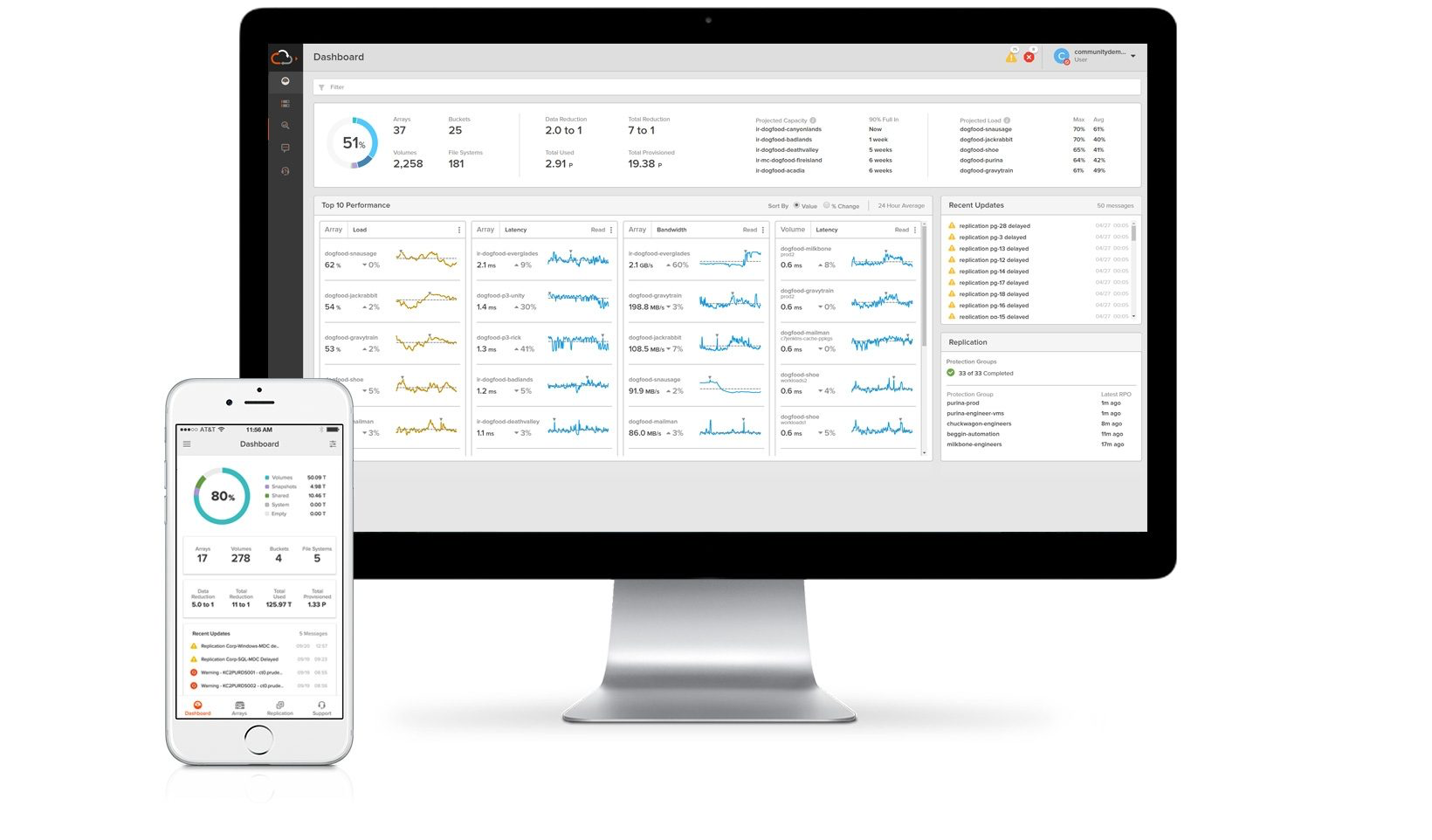
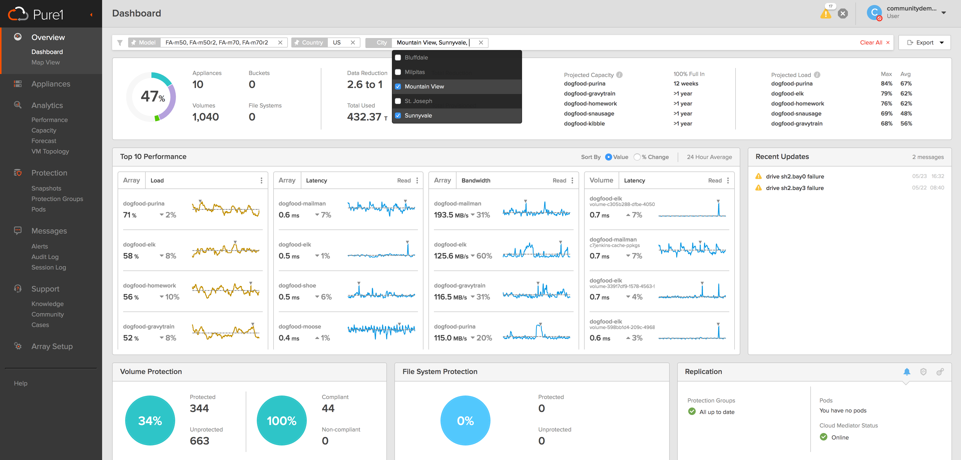
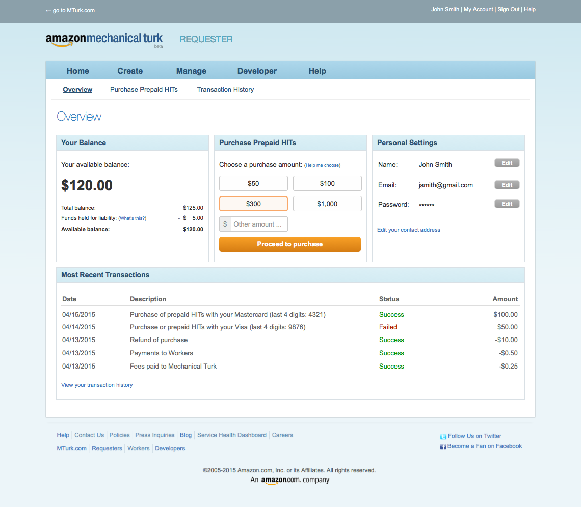
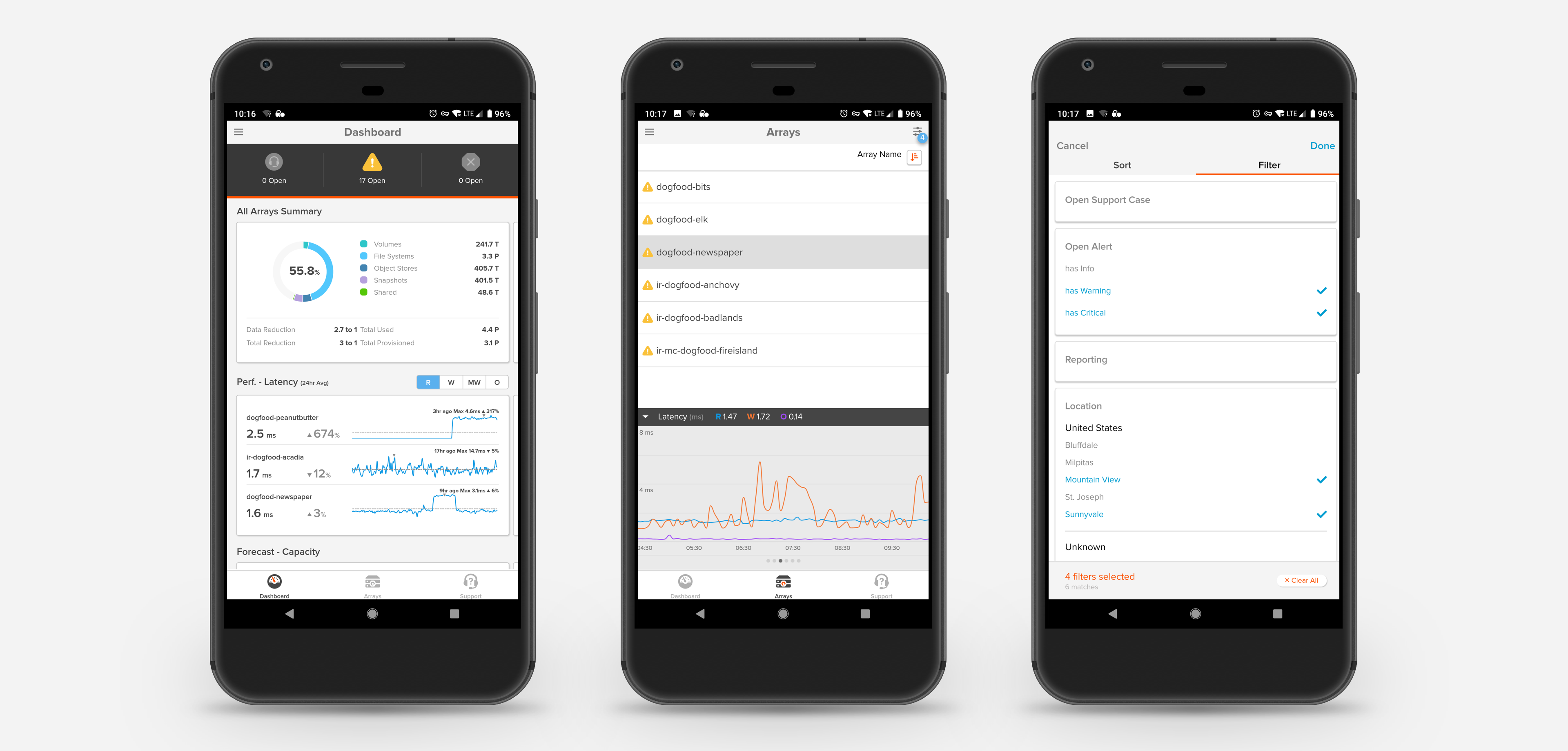
Pure1 is Pure Storage's Cloud-based tool for customers to manage their fleet of storage arrays. Using Pure1, storage administrators can monitor what's going on with their storage system, receive alerts, interact with our amazing Support team, and perform analysis on their storage system.
Born in 2015, Pure1 has gradually grown from a monitoring tool to an analytics platform that leverages big data and machine learning to provide insight that simplifies storage administrators' job, and make them look like super (men|women).
When most of us run out of storage space on our Macbook, we delete the 259 cat videos to reclaim precious disk space. But when enterprise customers run out of storage capacity (space, performance, or both) they cannot just delete accounts, records, and other contents to regain space. As a result, it's imperative for storage administrators to do due diligence and plan ahead for their storage needs far in advance.
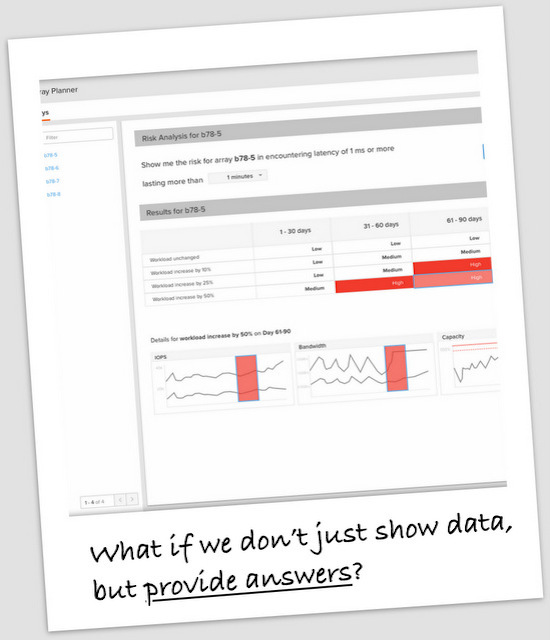
Up until we released Pure1 Forecast, our customers had always carried out forecast analysis by manually exporting historical data into spreadsheets, burning midnight oils to crunch these numbers (while watching their cats curling up next to them), and then prayed. This process is mundane and often extremely difficult, as storage capacity growth is a non-linear multivariate function of past system usage, hardware configuration, and workload characteristics over time.
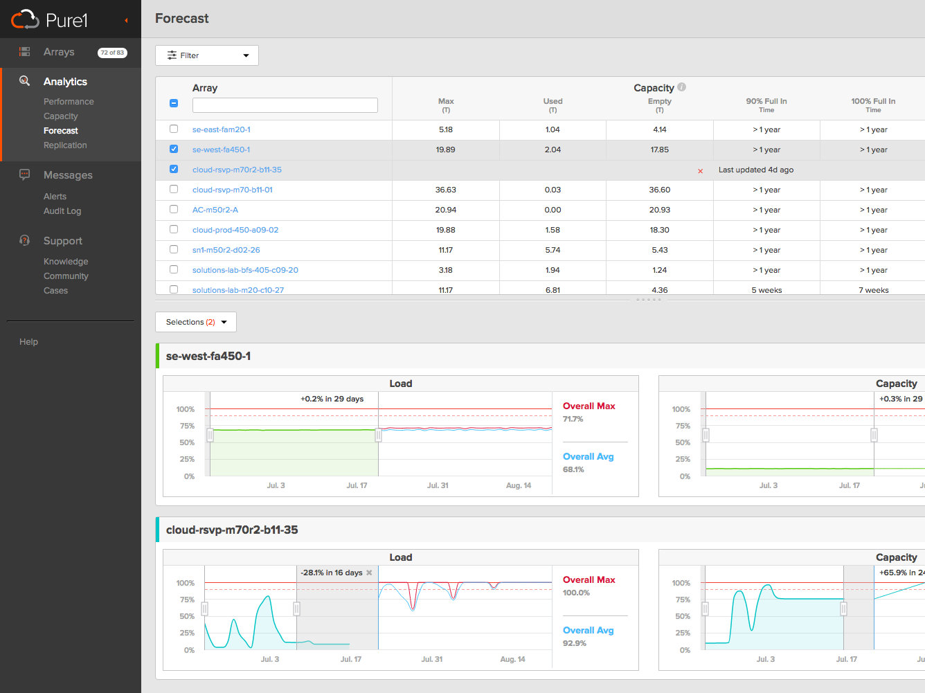
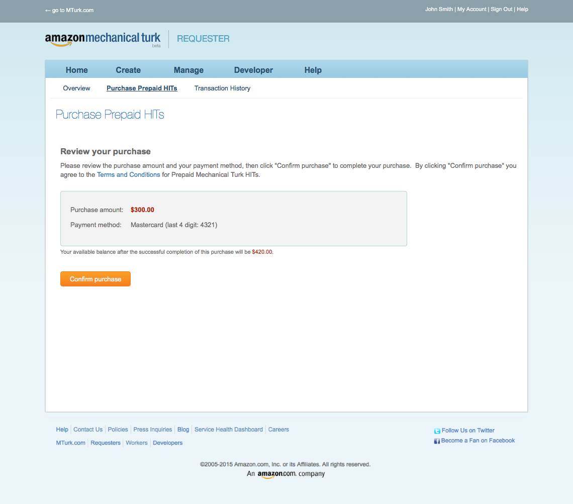
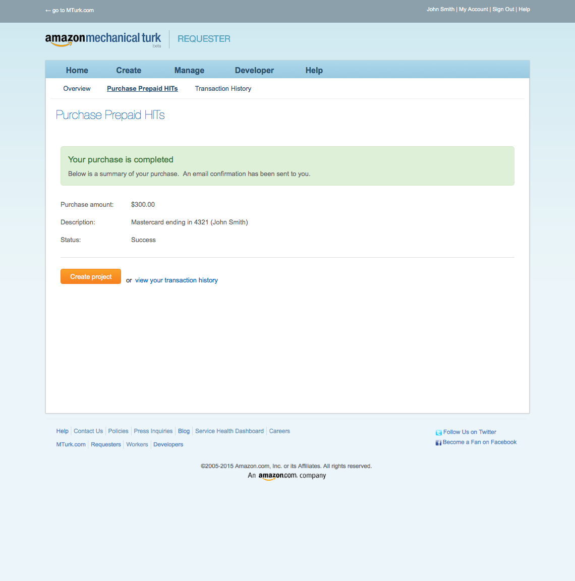
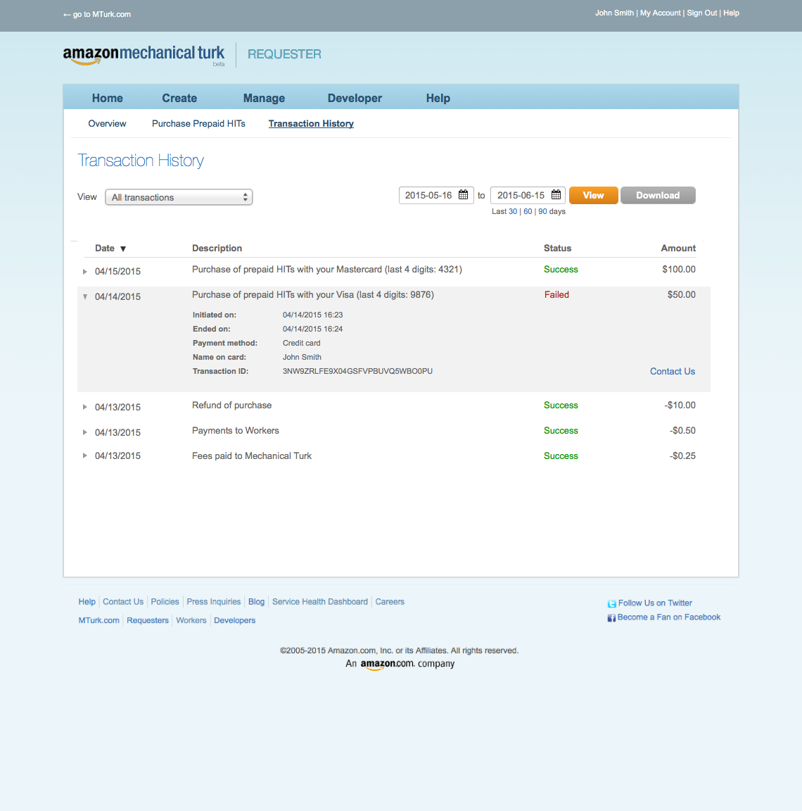
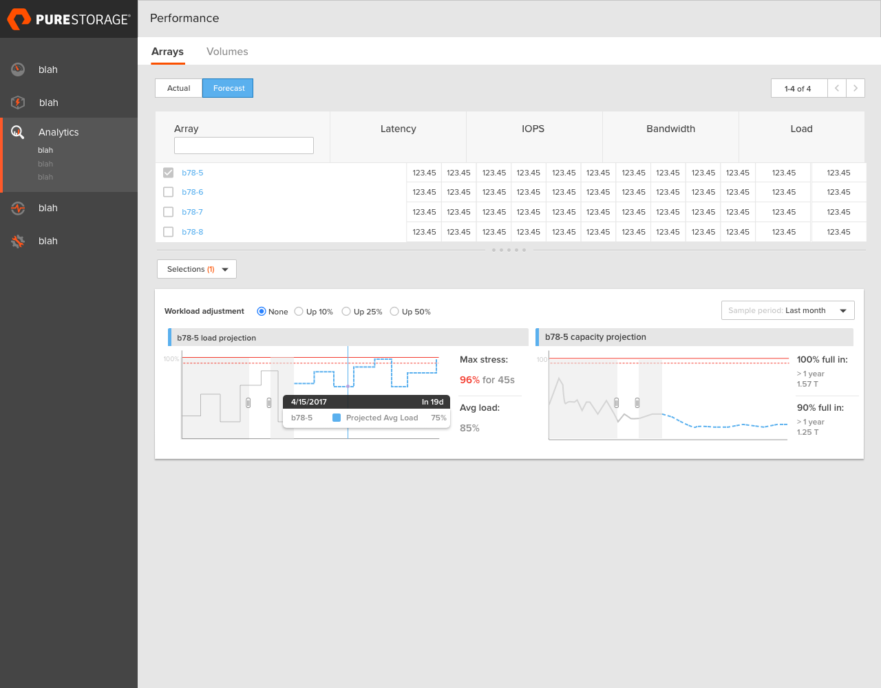
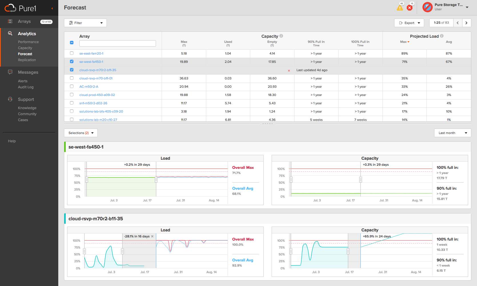
Forecast is a game-changer. For Pure Storage, it was a milestone that brought our Analytics to a new orbit. For customers, the Forecast tool gives them an interactive crystal ball to see when they will hit performance and space usage wall. Gone are the days of exporting the CSVs and doing number crunching one-by-one. In a single click, storage administrators can now see the forecast for all their arrays.
The Forecast tool also lets our System Engineers to better serve their customer accounts, giving them the ability to communicate upgrade schedule and the urgency of the upgrade in a transparent and effective manner.
We forecasted how the environment would grow thanks to our forecasting tools. Every month we showed how our forecasting matched what was actually happening in their environment, a level of analysis that is unmatched with our competition .- System Engineer at Pure Storage -
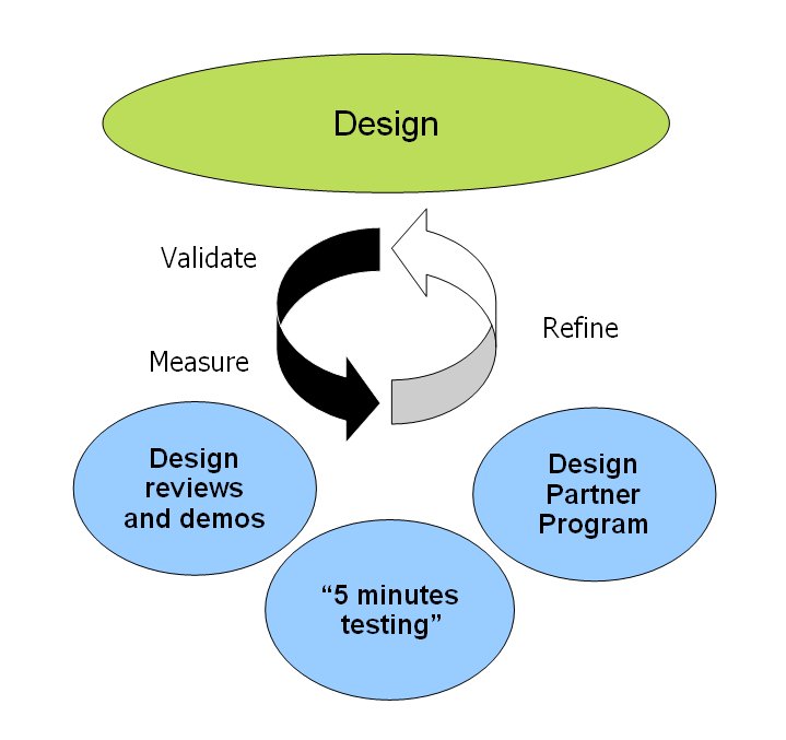
As the lead UX designer on the project, I worked relentlessly with the Product VP, the PM, the Data Science team, the Engineering team, and my UX teammate to deliver a simple solution that our customers love, but the process of achieving simplicity is anything but.
We started by interviewing business stakeholders to understand the big picture - what this feature is for, what its values for customers are, and what the long term road map looks like. From there, we began our first stage of ideation.
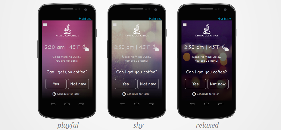
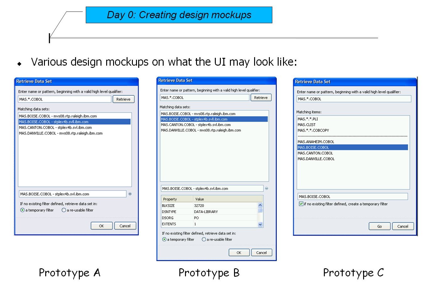
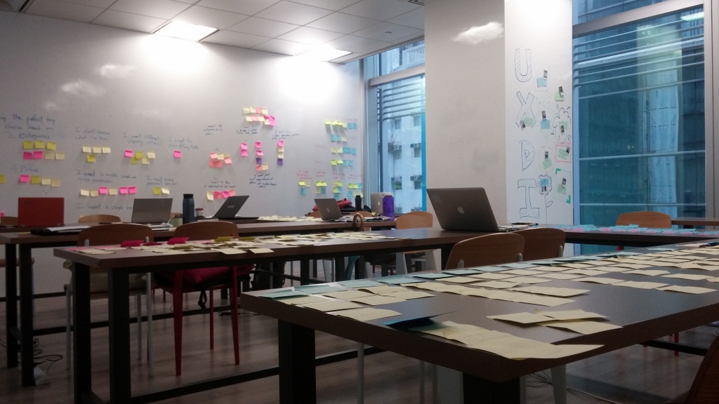
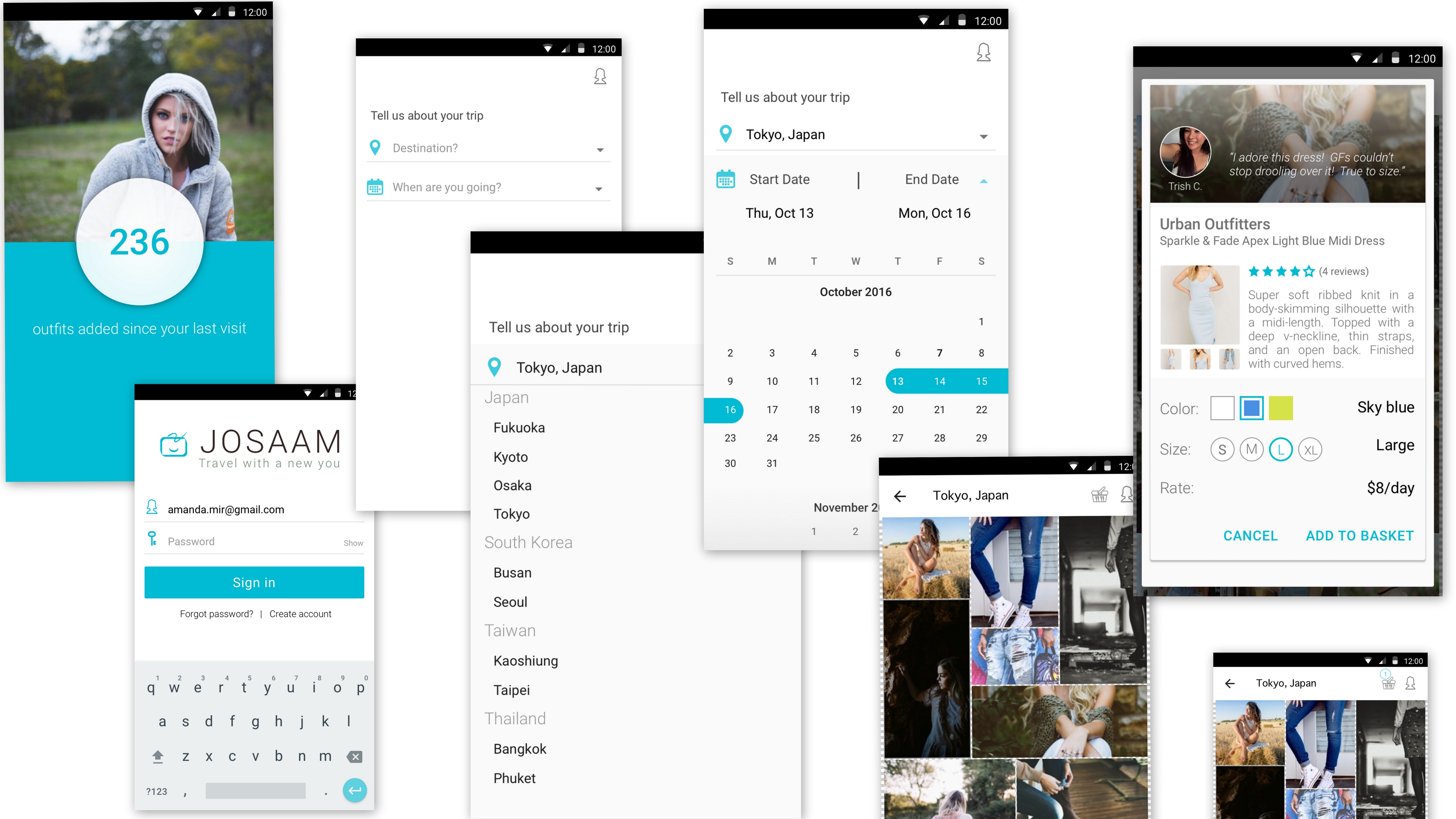
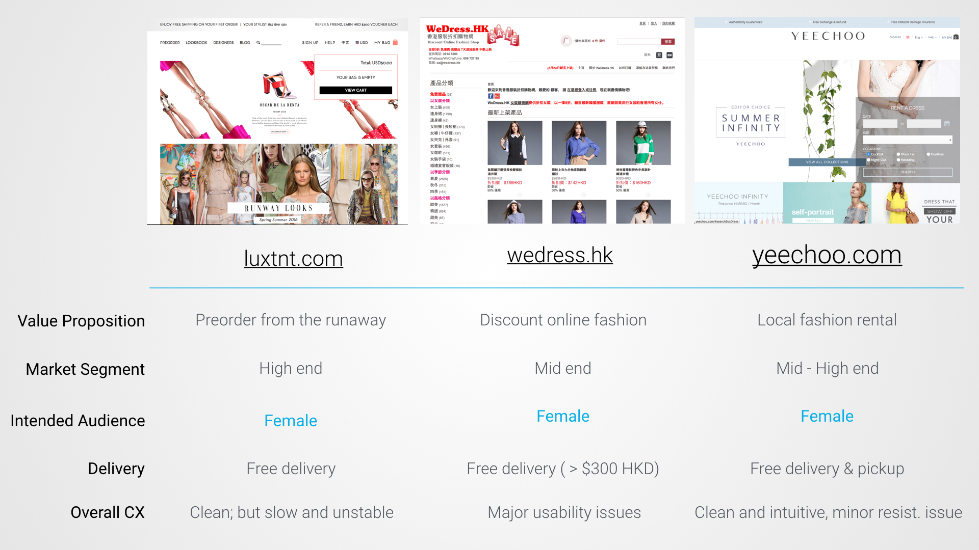
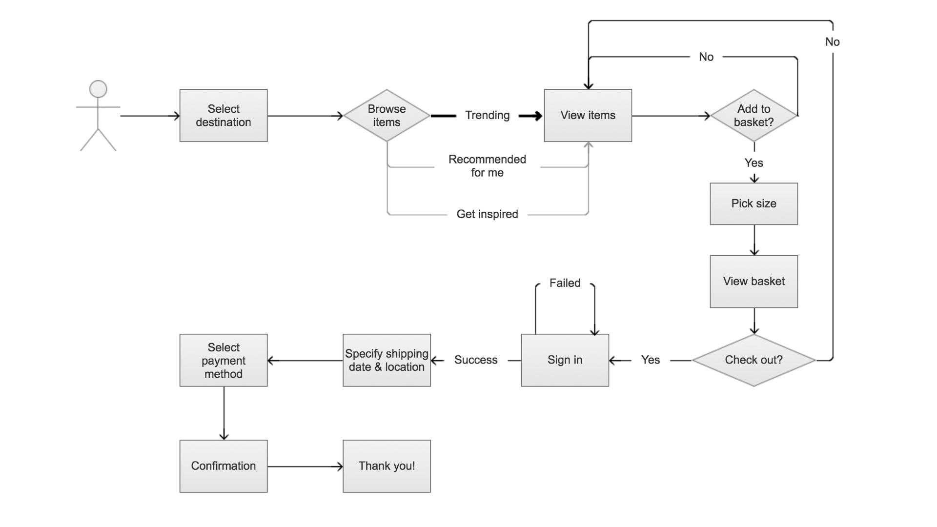
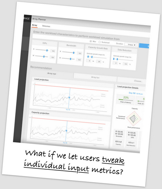
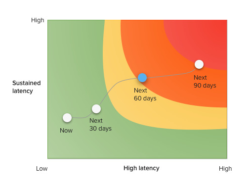
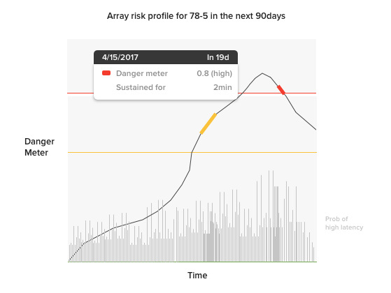
In the early stages, we explored and experimented with different elements in an attempt to dig deep into the problem space. Over multiple iterations we tested and got feedback on ideas ranging from terminology, layout, visualization, degree of flexibility, data granularity. Below are some of the ideas we explored:
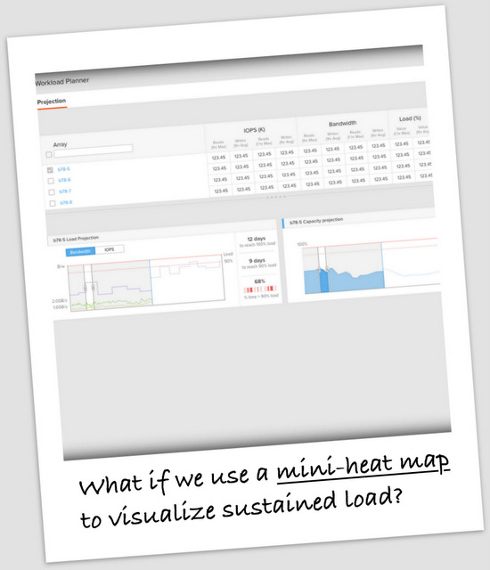
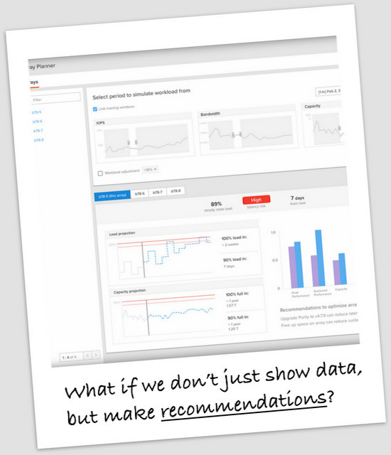
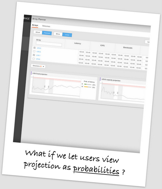
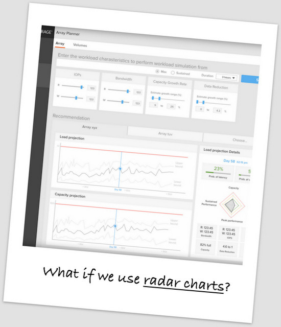
We discussed the pros and cons of the different ideas to narrow the design down.
As the GUI choices narrowed we continued to experiment with visualization techniques and terminology. We dove deep into exploring how to use the data to tell the right stories - to communicate the information accurately without burdening users with unactionable details.
Below were two of the many ideas we experimented with during this phase which we ended up not implementing. I personally love them, but we didn't feel like they communicated the right message.
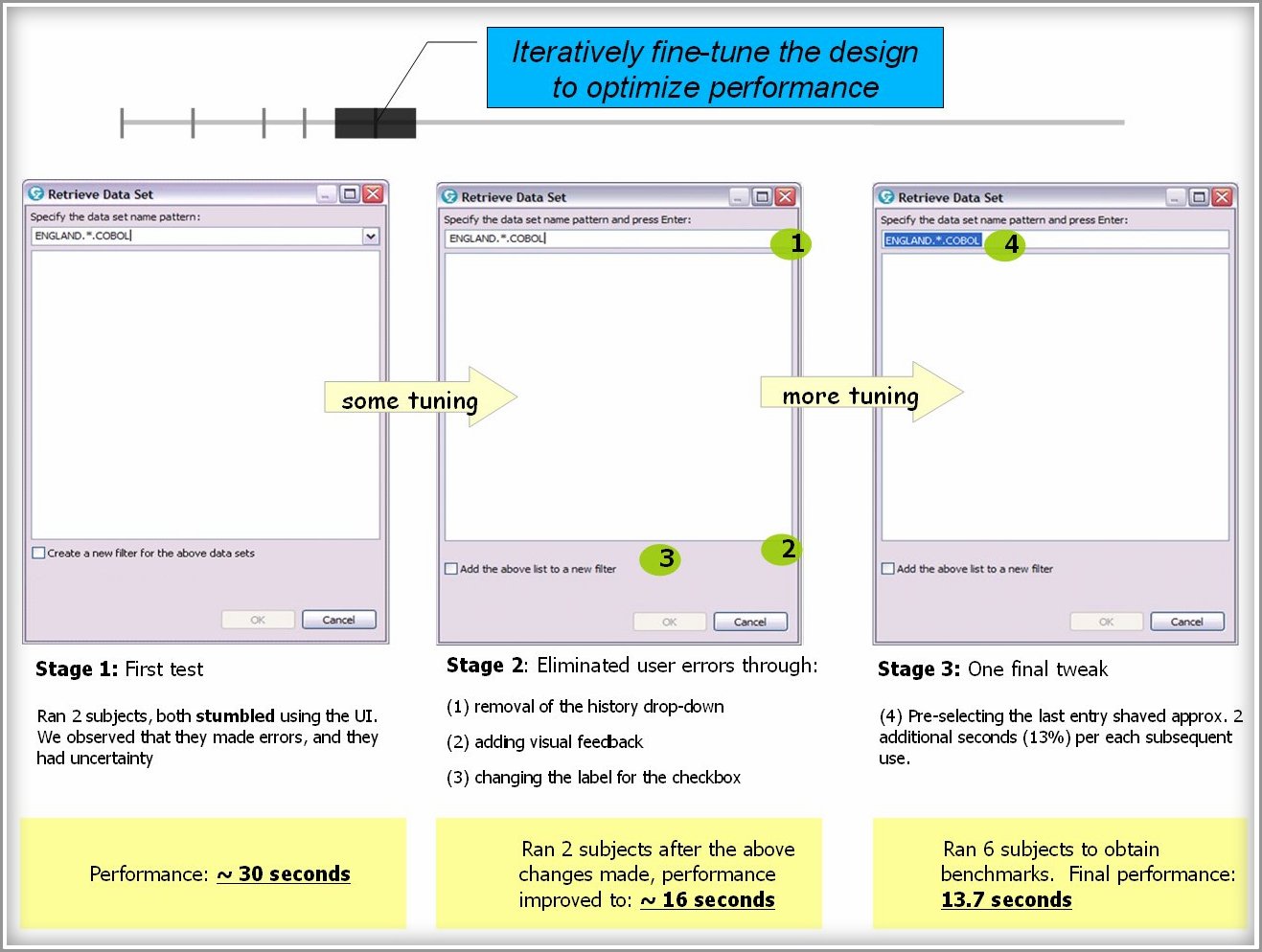
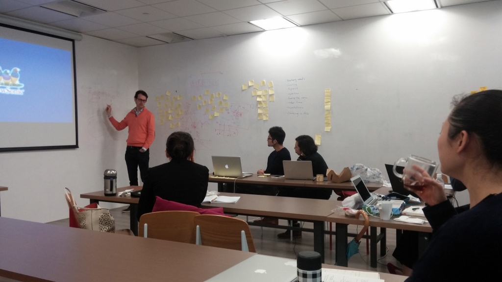
Through a vigourous and intense process that involved frequent stakeholder reviews, our first prototype emerged out of this concept that was "simplicity-centric":
Working with our incredibly talented dev team we built the first prototype wired with test data from the backend. We demo'ed our new toy at our customer conference in June to test the water.
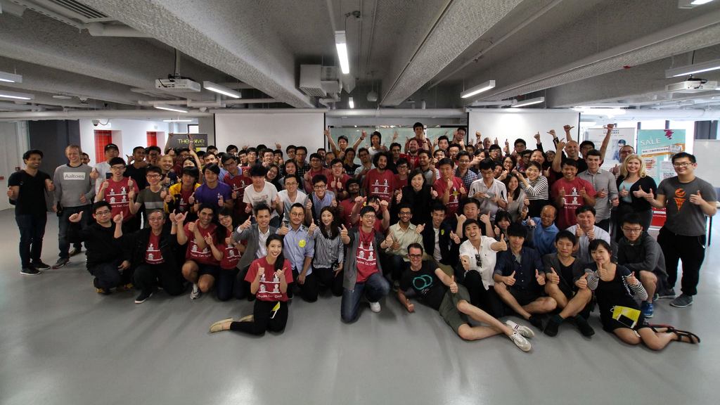
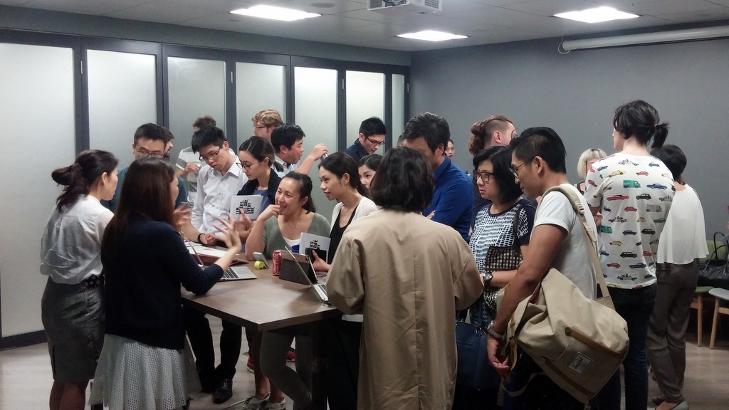
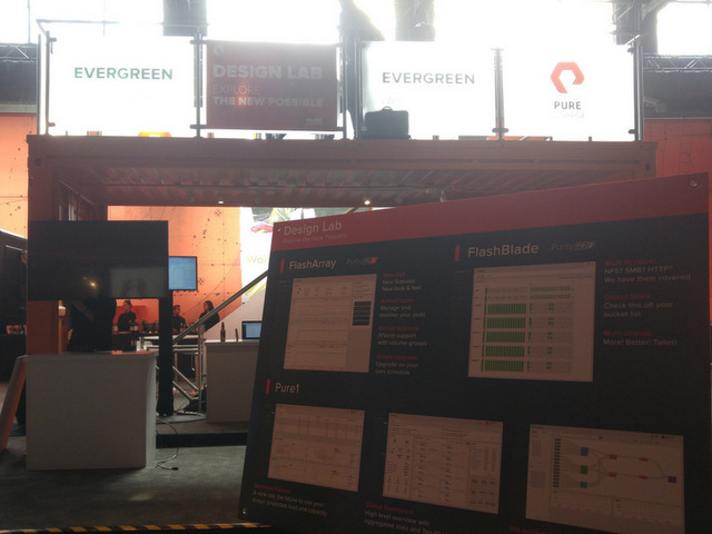
I ran our Design Lab at our customer conference. This was Day "T-1".
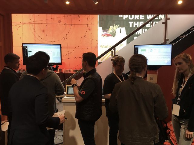
Getting feedback from customers is a team sports. Our entire team got really into it.
The overall feedback validated our simplicity-first design choices, and we used the valuable feedback from over 40 customers to help us tune our design. Over the course of the next month we repeated this feedback cycle multiple times with a wider audience. From behavior to performance to the look-and-feel, we continued to fine-tune our deliverable, and eventually shipped a feature we all felt very proud of.
With the release of the first version of Forecast, we are only scratching the surface of what we're capable of doing in delivering our vision of self-driving storage. Exciting time ahead and we can't wait to unveil what's next for our customers.
Giving credit where it is due
Designers have mixed feelings about Bootstrap. I happen to like it. I love its ease-of-use. I love its extensibility. I love the speed at which you can get things done. And I love its elegance.
In creating this site I chose to use Bootstrap early on, primarily for the aforementioned reasons. To achieve expediency, I also leaned heavily in the wonderful work of the folks at StartBootstrap and then customized the CSS to fit my style. This enabled me to focus on the contents - which in my mind is the hero - and put together this site quickly and elegantly. For motion design, I leverage Daniel Eden's animate.css library to help guide users' visual flow. I want to acknowledge and thank them for their wonderful work.
The source of the hero image you see is the fine work of Nicolas Jeffries sourced from unsplash.com. This image resonates with me in multiple ways. Design is a team activity, just as playing in a band. As a lead your role is often like a drummer, you aren't always the lead singer or the guitarist, but it's your drum beats that guide the team in their performance. Deep thoughts! No? =)
Finally, designers should be no stranger to CSS-trick. I learned a number of valuable tricks from it and I definitely want to acknowledge its influence on the CSS for this site.
The rest of the site - well, that's the work of Steven Ma the designer. Thanks for reading this section, it's great to know someone cares about how the work was constructed, and who the behind-the-scene contributors are.